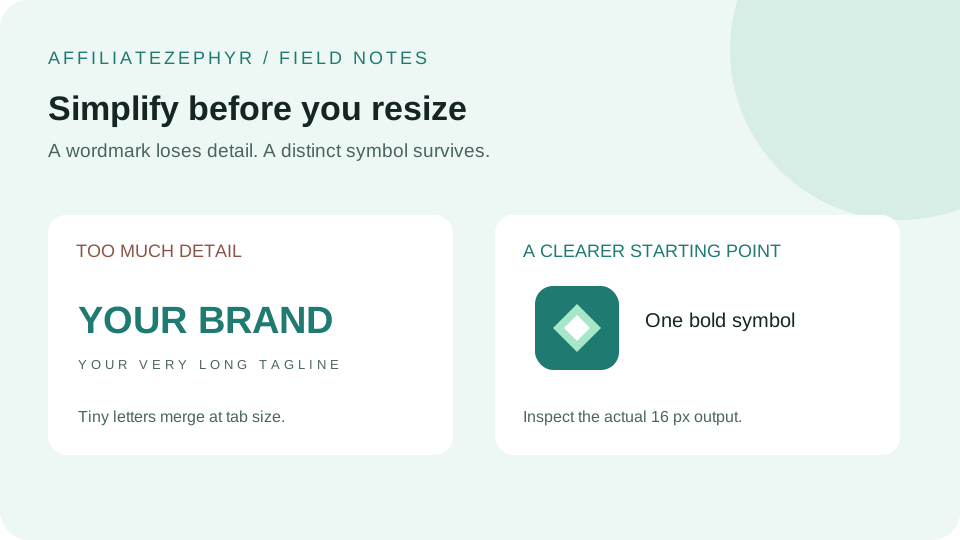
Brand guidelines typically emphasize strict consistency — the same colors, the same exact logo file, used everywhere. Favicons are a genuine, well-justified exception to this general rule, and understanding why helps make a better design decision.
The general case for consistency
Brand consistency exists for good reasons — it builds recognition over repeated exposure, reduces confusion, and reinforces a professional, cohesive identity. In most contexts (business cards, letterhead, website headers), using the exact same logo file everywhere is the right call, and this instinct isn't wrong in general.
Why favicons are a legitimate, specific exception
The core issue is one of physical constraint: a full logo, especially one with a wordmark or multiple elements, often simply cannot survive being shrunk to 16x16 pixels while remaining legible — a genuinely different situation from choosing whether to use the "right" logo file, since the constraint here is closer to physical impossibility than stylistic preference. Our guide on designing for 16x16 covers this limitation in detail.
What "matching" should actually mean for a favicon
Rather than pixel-identical reproduction, favicon consistency is better understood as: using the same core visual element (the icon mark, a specific color, a distinctive letterform) that a viewer would still recognize as connected to the main brand, even though the specific execution has been simplified for the constraint. This is sometimes called "brand-consistent adaptation" rather than "exact reproduction," and it's a completely standard, expected practice in professional brand design, not a compromise or shortcut.
A useful mental test
Ask: if someone who knows your brand well saw only the favicon, in isolation, would they recognize it as belonging to you? This is a more useful standard than "is it pixel-for-pixel identical to my main logo," since the latter is often genuinely unachievable at favicon scale without sacrificing legibility entirely.
When exact matching does work
If your logo is already simple — a single bold letter, a basic geometric shape, minimal detail — it may well survive the shrink to favicon size without meaningful adaptation, in which case exact matching is both possible and the right choice. This is more the exception than the rule for typical multi-element or wordmark-heavy logos, but it does happen.
Common brand elements worth preserving even when simplifying
- Primary brand color — even a simplified favicon shape should generally use your actual brand color, not an unrelated one
- A recognizable letterform or icon shape — if your brand has a distinctive icon element, preserving its basic silhouette, even simplified, maintains a real connection to the main brand
- Overall visual "feel" — sharp vs. rounded, geometric vs. organic — maintaining this general character helps a simplified favicon still feel like it belongs to the same brand family
The bottom line
A favicon that captures your brand's essential visual identity in a simplified, legible form serves your brand better than one that attempts strict pixel-for-pixel logo reproduction at the cost of becoming an illegible blur — professional brand design treats this adaptation as standard practice, not a compromise.
Create your adapted version
Once you've settled on a simplified, brand-consistent design, our free Favicon Generator handles generating the complete size set from that single adapted source image.
Keep reading: